
How to use pivot tables and slicers
Creating dynamic reports with Zebra BI is extremely simple and effortless.
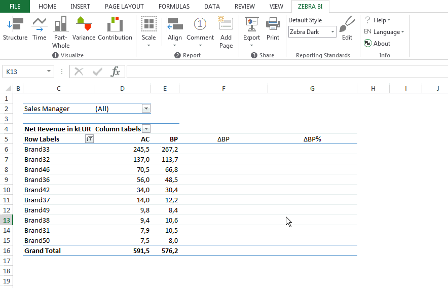
Often enough in your business reports, you’ll get pivot tables embedded in Excel. These are tables which include changeable categories and that can be sorted and updated automatically. Lucky for you, the charts created with Zebra BI will automatically change with the updated pivot table, too! Therefore, you won’t have to create a separate graph for a changed table anymore. You just create one Zebra BI chart which will realize any changes made to the pivot-table and update itself accordingly. Check out how easy it is:
We’ll do this step-by-step, so it’s really easy to follow. First, we’ll show you how your report could look like.
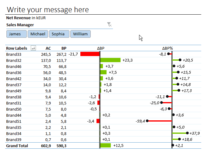
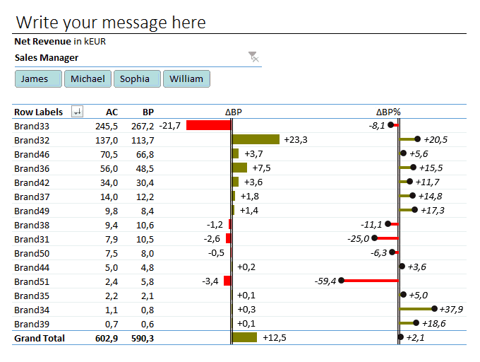
Wouldn’t it be great if your reports looked like this? … Well, they can! Continue reading to find out how.
Your standard dynamic report consists of 3 parts. A slicer, a pivot-table and the respective charts. These 3 parts combined are what makes your report truly remarkable. You are able to analyze all data underlying your pivot table visually!
Creating reports like this from a pivot-table won’t take you longer than a couple of minutes. In fact, it can be done with just a few clicks.
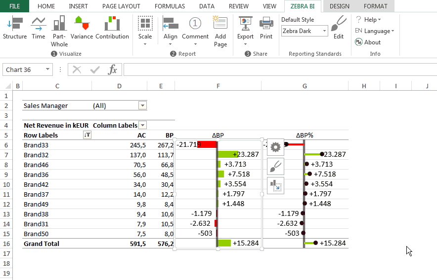
You will need to create two extra columns next to your pivot-table (one for absolute variances and one for relative variances). Zebra BI allows you to fit your chart exactly into the columns next to your pivot table. See below how to do it:
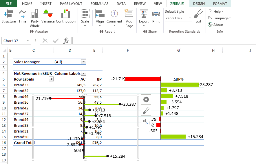
1. Create the charts
Click on the Zebra BI ribbon and choose your desired chart types. In this case we are using absolute/relative variance charts.
2. Fit the charts in the respective columns
Click on your first chart and select the Move Chart button. Then mark the desired cell range in Excel to which you want to fit your chart.
3. Change the number format as needed
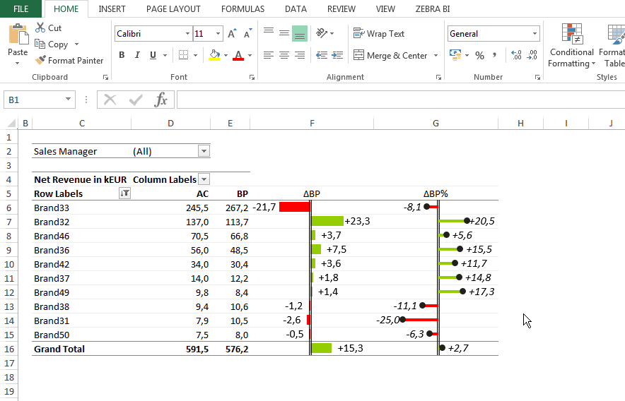
Zebra BI allows you to change the number format right inside the charts. This can be extremely useful for the readability of your report. In our case we wanted to create absolute/relative variance charts, so we also needed to change the number format of our second chart to relative. As you can see, there is no additional table necessary – Zebra BI automatically calculates the relative percentages for you!
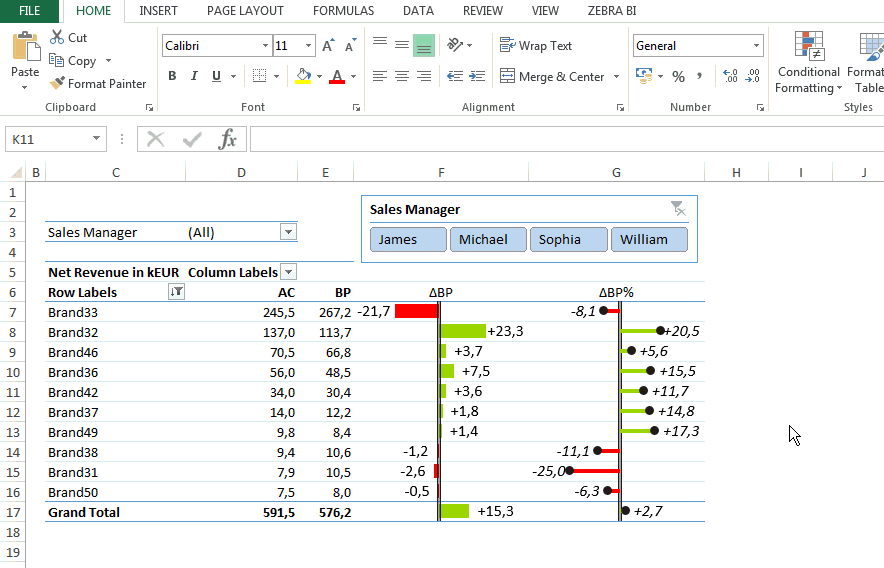
4. Create the Excel Slicer
Now we’re coming to the final part of our report – the slicer. It adds to readability and usability of your report. Inserting a slicer in Excel is relatively straight-forward. Just click anywhere inside your pivot-table, then click Design on your Excel ribbon and choose Insert Slicer. A new window will open, which allows you to choose the desired categories you want to “slice”.
5. Format the slicer
If you wish, you can now format your slicer so that it better fits your report. To do so, just right-click on your slicer and select Size and Properties. A new ribbon will open on the rightmost side of your screen allowing you to adjust the format of the slicer. You can change the layout and the style of your slicer and disable resizing and moving of the slicer if you want it to stay at its original position.

6. Use the slicer to switch between data sets
Your report is now finished. You can use the slicer to switch between data sets. Observe how the Zebra BI charts are changing accordingly. Isn’t it great? 🙂
We hope you enjoyed this step-by-step tutorial and wish you happy reporting!
