
Which chart should I use?
In this article we will explain how to choose the right chart for your data. Or more precisely, for your message. There are 3 fundamental rules that you should always follow. If you learn these 3 rules, there is a good chance that you will get it right no matter what the context of your data is.
So, without further ado, let’s start with rule no. 1.
#1 Display time horizontally, category items vertically
Let’s focus on the most frequent business charts, such as column and bar charts, line and area charts, dot plots or pin charts, plus-minus (variance) charts, etc. Your first decision should always be whether to turn them horizontally or vertically.
Here’s on what you should base your decision:
TIME
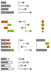
Use horizontal charts for time series
This means that your data categories are years, quarters, months, weeks, days or date/time values. That’s it. Time should always run from left to right, never from top to bottom. It is a simple convention that everybody understands.

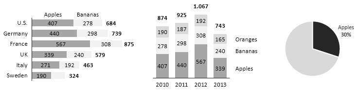
- Horizontal Business Charts
Of course you can visualize other types of data categories with horizontal charts. But you will probably run into problems with labeling and category spacing. If you really want to make an exception to this rule, do it only when the number of data categories is very small and their labels (names) are short.
STRUCTURE
Use vertical charts in all other cases
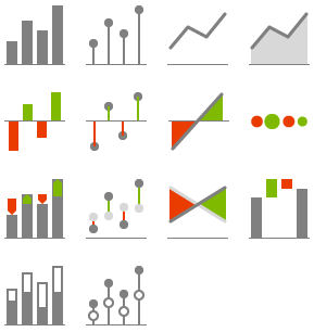
When you have discrete items (categories or structure data, such as products, customers, accounts, etc.), use vertically oriented charts, such as a vertical Bar chart, vertical Dot chart, vertical Waterfall chart or vertical Circle (Bubble) chart.

- Vertical Business Charts
Vertically oriented charts have two major advantages over horizontal charts:
1. It is easier to display category labels
2. You can insert them into tables, thus creating combined table-chart reports
Charts can also have circular (polar) orientation, such as a pie chart or “spider” (radar) chart. Additionally, we have 2- or even 3-dimensional charts orthogonally oriented in a two-dimensional space, for example scatter plots (XY charts) or bubble charts. Here is a summary of all possible chart orientations and when to use which:
| Orientation | When do I use it? | |
| 1. | horizontal | Use only when your data represents time series (years, quarters, months, weeks, days or date/time values) |
| 2. | vertical | Use if you have discrete items (categories or structure data, such as products, customers, accounts) |
| 3. | circular | Avoid whenever possible. Use only when the number of categories is extremely small (2 or 3 categories) |
| 4. | 2D | Use when you have 2 or 3 variables in your data, such as in bubble charts or scatter plots |
#2 How to choose the right chart for your message
BI/reporting/visualization tools usually offer a large set of chart types to choose from. So it is extremely important to understand and predict the nature of the analytic task that your readers will perform when observing your charts. You should always ask yourself: What message am I trying to convey?
For example, you might simply want to show an interesting trend in monthly values. Or enable your readers to compare sales values of different products. Yet another time, you might expect that the readers need to understand the variance to budget, growth from previous year values or the contribution of specific products’ variance to the total variance.
Here is our cheat-sheet to help you select the right chart for the most common tasks performed by business users:
STRUCTURE ANALYSIS (COMPARISON)
Structure analysis is the most basic analytic task where the reader observes the displayed values and visually compares data categories to each other. These comparisons are usually of the following nature:
- Looking up a specific value (e.g. finding the sales value of a specific product)
- Comparing two values
- Ranking (trying to establish the sequential order of one or more data categories)
- Observing patterns in the data (subsets of values with a specific pattern)

Learn how to insert structure charts in Zebra BI.
TIME-SERIES (TREND) ANALYSIS
Time series (trend) analysis is a similar task to structure analysis but only performed when the data categories represent time (years, quarters, months, weeks, days).
Depending on the situation, the reader will perform the following types of comparisons within the displayed time series:- Looking up a specific value (e.g. the sales value of the last month)
- Comparing two values
- Observing trends in the data (subsets of values with a specific pattern, e.g. linear growth or other type of seasonality)

Learn how to perform time-series analysis in Zebra BI.
PART-TO-WHOLE COMPARISON
Here users try to assess the relation of a part to the whole value (e.g. sales of one product to total sales of the company). The analysis exposes the “significance” of each part relative to the total value.
 Learn how to prepare part-to-whole comparisons in Zebra BI.
VARIANCE ANALYSIS
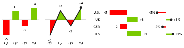
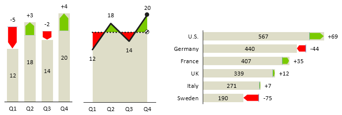
Variance analysis is the most fundamental task in business reporting. Understanding deviations from targets or budgets and growth rates from previous periods is a core requirement in almost any organization. Use “plus-minus” charts to show variance over time or over structures:
 Use “integrated variance” charts to display actual values as well as absolute deviations. Since both values (actual and deviation) are shown, the user can evaluate both the importance of a deviation (its magnitude) as well as its relative share of the actual value at the same time:
 Zebra BI offers strong support for variance analysis. Read all about it here.
CONTRIBUTION ANALYSIS
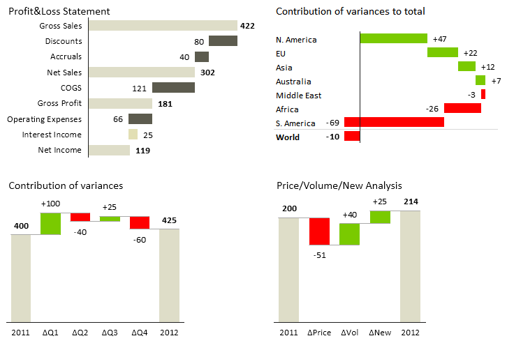
Contribution Analysis is a special type of part-to-whole analysis to assess the contribution of all parts to the whole value. There are two main versions of Contribution Analysis: (1) Contribution of variances and (2) Structure – contribution of structure elements (categories). Use “waterfall” charts for contribution analysis. Here are 4 typical examples:
 With Zebra BI you can insert waterfall charts with just 1 click. Check out how to do it: Contribution Analysis – Waterfall Charts.
#3 Consider optimal shape
Once you have determined the correct chart orientation and the intended task of your visualization, you are ready for your last major decision: Which chart shape should I use?
This decision is usually the hardest one. Why? Because it depends on many factors and you will also frequently bump into the dilemma whether to follow the laws of perception or rules of consistency. So let me explain these two in some more detail.
Laws of perception
The laws of perception determine how we perceive and interpret shapes. In reporting practice this means that users will comprehend different shapes and different organization of shapes differently. Therefore, the perception of a shape also affects the interpretation or at least affects the time of “understanding” the messages derived from your data.
Let’s illustrate this with the following practical examples:
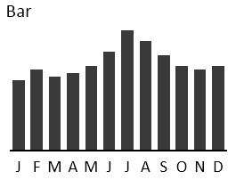
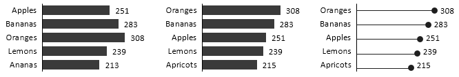
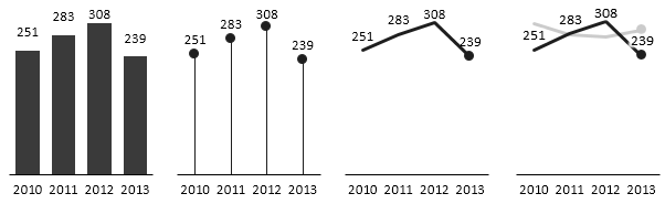
While the overall shape of a column chart allows us to see the trend, the vertical orientation of bars supports us in making single value comparisons (comparisons of height of two single values, such as Apr to May or Dec to Jul).
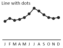
The flow of the line emphasizes the trend, while the dots mark the height of a single value.
There is much more emphasis on the continuation or the flow of the values (trend analysis), but still some support for single value comparisons.
There is no explicit graphical support for single value comparisons, making it very hard to estimate the differences between particular months.
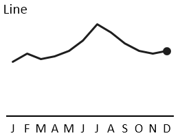
The only “gestalt” rule left is the continuity of the line, clearly exposing the trend in the data.
While more gestalt laws govern the perception of shapes used in charts, the law of “Prägnanz” insures that the simplest and most stable interpretations prevail. In our case it is quite clear that the perception of different chart shapes is ordered from vertically oriented bars (“columns”) to more “horizontally” oriented lines:
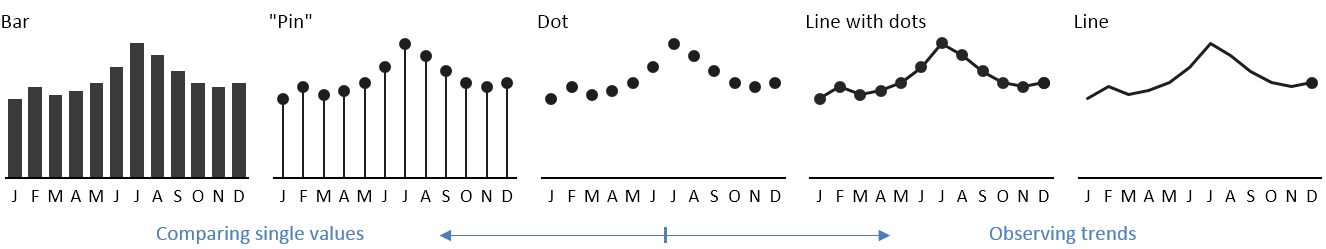
Perception of time-series charts
The practical implications of that are:
- Use the chart shapes on the left if single values (e.g. monthly figures) are important to the users and when you expect that users will compare values between each other (e.g. current month to previous month). Also note that this is only meaningful when charts are big enough. With small chart sizes or small category widths choose lines charts instead.
- Use the chart shapes on the right if you want the users to focus on overall trends.
Rules of consistency
It is relatively easy to select the perfect chart and the perfect chart shape when you only have one chart. It’s not rocket science and many researchers and authors have written guidelines on how to do this. But business reporting is so much more than just designing one single chart. In fact, most of the time you will have to use several charts at once to get the full message across to your readers.
For example, you might need to design a whole report page or produce a full report with many pages, a BI dashboard with several hyperlinked screens, etc. And this is when you should start thinking about consistency as well. In the same way as traffic signs are expressed by consistent colors and shapes across the world, elements in business reports should be consistently designed to depict or “code” the same meaning with always the same shapes, colors and patterns, too!
Instead of always just using the “default” and identically-looking column chart regardless of what it actually represents, you should use different chart shapes for different types of values (KPIs):
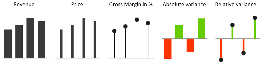
As you see the chart for the Price is much thinner than the one for the Revenue. This is quite intuitive, because revenue values are usually way bigger than prices (price is a ratio of revenue, divided by quantity). Once readers understand this, they will instantly know what they are looking at, even without reading all the labels.
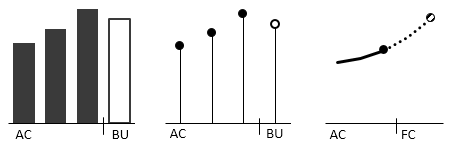
This is called shape coding. Similarly, you can use patterns to code data scenarios like Actual, Budget, Forecast and Previous Year. For example, here is how budget values can look like:
Guidelines like these are thoroughly covered in IBCS (International Business Communication Standards). With Zebra BI you can implement them in Excel with just one click. But remember, before you click to insert your perfect chart: Think about the 3 fundamental rules!