
Inserting your very first Zebra chart
Congratulations! You have successfully installed Zebra BI and now you’re ready to create your very first Zebra chart.
To help you get started with Zebra BI, we suggest that you start with the Getting Started tutorial, which you’ll find on the Zebra BI ribbon in Excel under Help>Getting Started Tutorial.
Let’s begin with an easy one!
When you open the Getting Started Tutorial, a welcome message will greet you and you will see a simple table with monthly data.
Step 1: Click anywhere inside the data table.
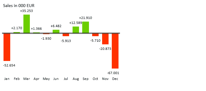
Step 2: Click Variance on the Zebra BI ribbon and select the column variance chart.
Congratulations, you have just created your very first Zebra chart!
That was super easy, right?
Well, Zebra has done all the hard work for you 🙂 Just think about it… you didn’t have to write any formula, adjust any property, color or number format! Zebra has:
- Detected and correctly understood your data (discovered actual and budget values)
- Automatically calculated the variance (Actual-Budget) from your source data,
- Created the chart
- Applied standard red/green colors
- Adjusted the number format for variance (e.g. added + and – signs in front of the numbers)
- Designed the “semantic axis” (double line on the axis means “Budget”)
That’s great, what can I do next?
Let’s try to format the numbers in thousands and discover a few more chart types.
1. Chart Settings
In order to set the number format to thousands with one decimal place, select the chart and click on the settings icon (the one that is shaped like a gear). The Visualization Settings window will open.
Click on the “Scale” drop down menu and select the format “000”. Click on the arrow pointing up under Decimals to increase the number of decimals to 1:
Zebra BI – set number format to thousands
If you feel eager today, you might also want to try the following:
- Try to display the relative variance instead of absolute (hint: under Display Variance select Relative (%))
- Click on the Negative is good check box (you will need this for costs, right?)
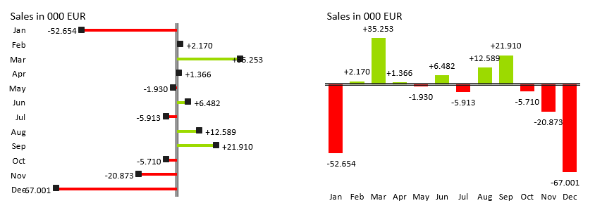
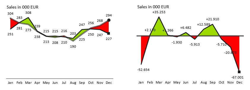
2. Try different charts
Let’s now explore some more Variance charts. Click again anywhere inside the data table and select other charts from the Variance menu on the ribbon.
Can you create charts like the ones presented below?
Congratulations, you’ve just learned the basics of creating and adjusting business charts in Zebra BI!
Zebra BI will offer you much more options to produce really insightful business reports, presentations and visual analyses. Please explore other topics to learn more and become a true reporting professional.