Using page templates – Variance charts
Here we’ll explain step-by-step how to create variance charts and align them with tables. Use this page template to create clean and informative variance analyses for your report. Here’s how to start:
1. Insert a new page template
To start off, we’ll show you how to insert a page template. Afterwards you’ll learn how to use them properly.
Inserting a new page template is easy, just click the Add Page button on your Zebra BI ribbon. A new window will open, allowing you to select your desired page template. There are 9 different page templates to choose from, each serving a distinct purpose. In this post, we will explore the page template for variance analyses.
Hint: You can also design your own report templates and move them into the page template folder to be easily available to all employees in your company.
2. Add your data
2.1 Click on the “+” button
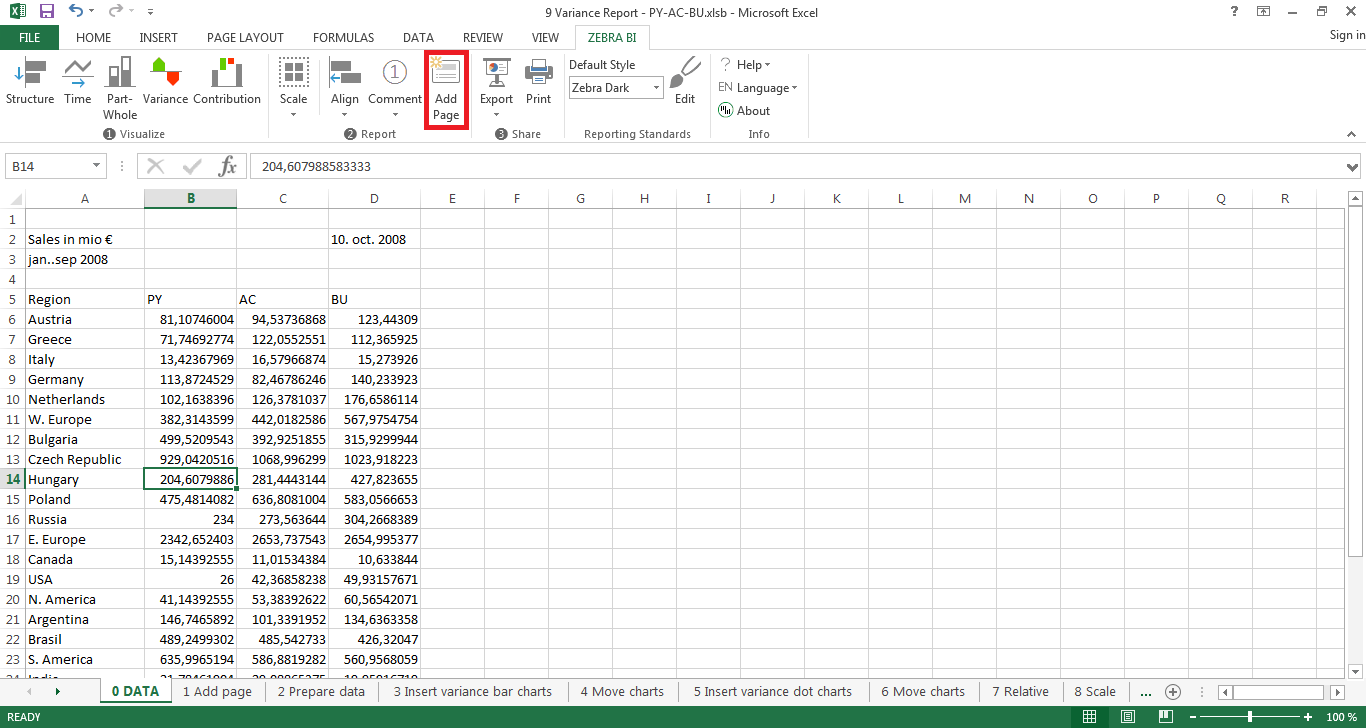
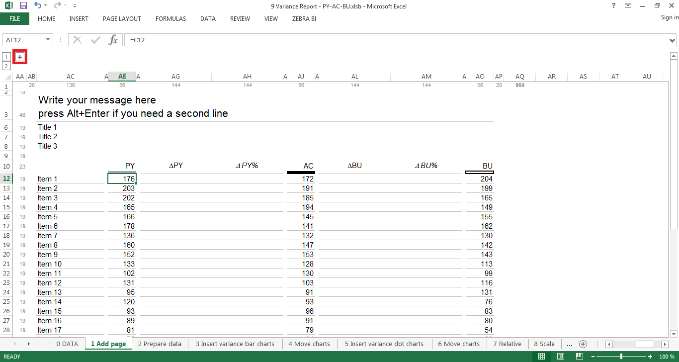
Now that you have inserted your first page template, you can start adding data. For simplicity purposes we’ve added a little extra space for your source data in case you want to calculate something which you don’t want to show up in your final report/slide. To show the cells you’ll use for your data, click on the little “+” sign on the top left (indicated by the red square in the screenshot below).
2.2 Prepare your data
You can use the additional field next to your added page to store and prepare your data. This is especially useful if you need to calculate certain KPIs using columns which you don’t want to show up in your report. Also it can come in very handy if you don’t want links between your worksheets and/or want to use pivot tables. You can hide the Prepare your data here section just as easy as you made it appear – Just click the minus button and it’s gone.
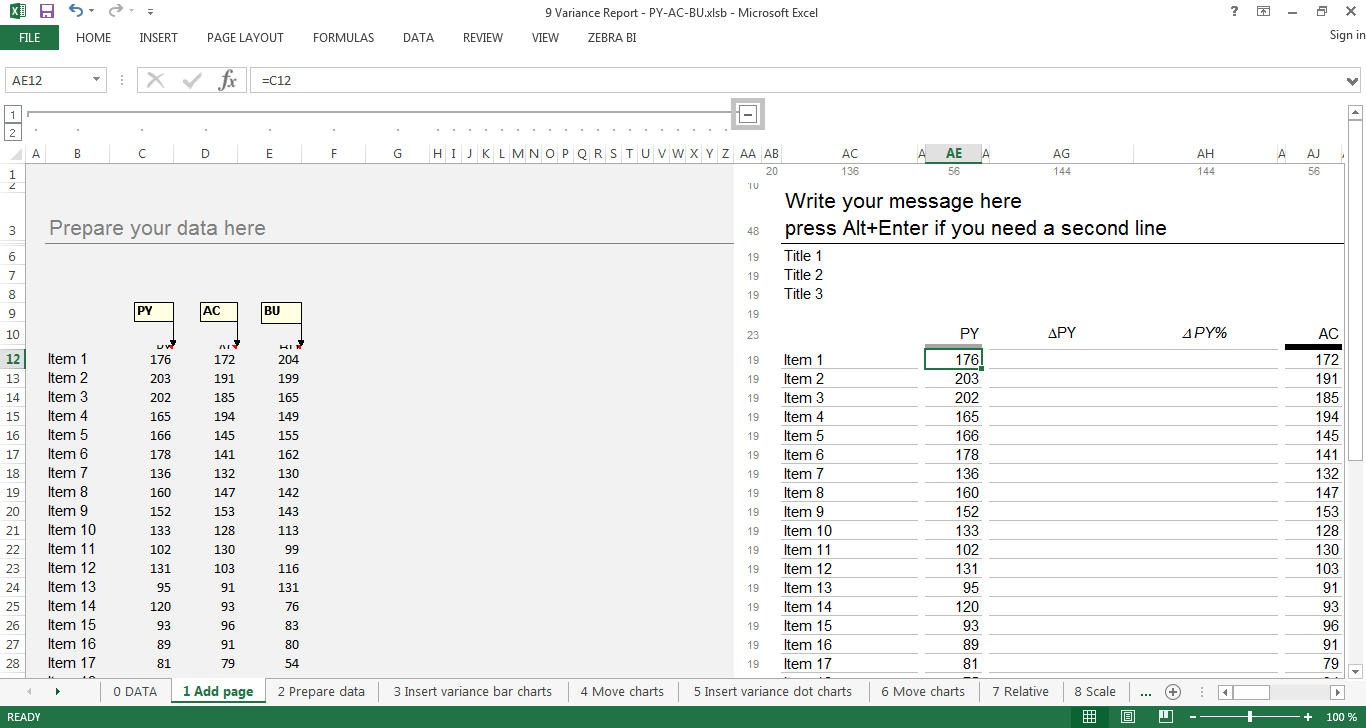
2.3 Link your data to the template
You can now link your data to the original page template by using Excel’s formula function (click a cell in your template and type e.g. “=C12” in our example). As mentioned before, this will come in handy if you want to calculate some performance indicators without having to change the layout of your reporting template. Once you are done doing that, you can create your first variance charts.
3. Insert your charts
3.1 Create your variance bar charts
Creating charts using Zebra BI just works as always. Select the respective cell ranges (first PY&AC, then AC&BU) and create two variance bar charts (in the Zebra BI ribbon, click variance and select the first chart).
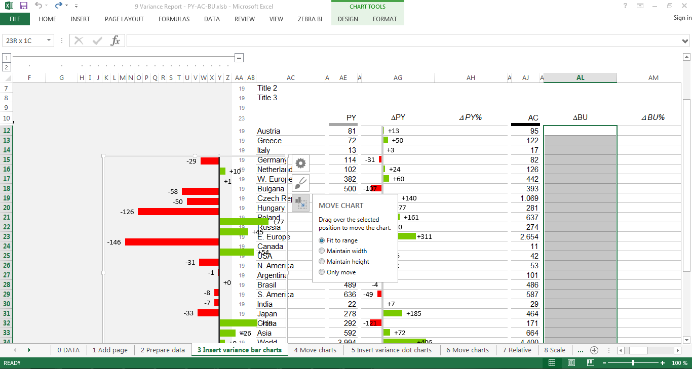
3.2 Move your charts
In order to properly include your charts into the reporting template, you will have to fit them to a cell range. This is done by selecting the respective chart, clicking the Move chart button and choosing Fit to range. Now all you have to do is mark the desired cell range and your chart will be moved into the desired column (in our example, the columns labeled ΔPY and ΔBU).
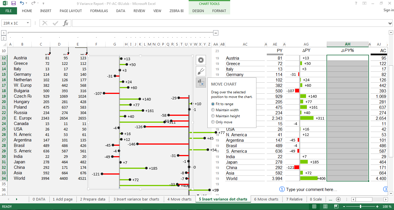
3.3 Create your variance pin charts
Next, we’ll insert the charts to display relative variances. We recommend using pin charts. Same as before, select the respective cell ranges (first PY&AC, then AC&BU) and create two variance pin charts (in the Zebra BI ribbon, click variance and select the second chart).
3.4 Move your charts
In order to properly include your charts into the reporting template, you will have to fit them to a cell range. This is done by selecting the respective chart, clicking the Move chart button and choosing Fit to range. Now all you have to do is mark the desired cell range and your chart will be moved into the desired column (in our example, the columns labeled ΔPY% and ΔBU%).
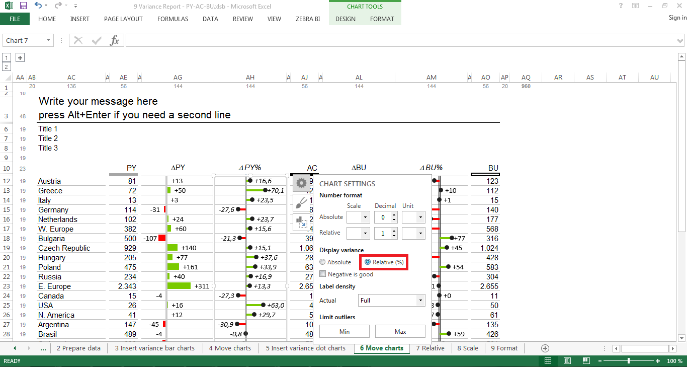
4. Display relative variance
Now it is time to calculate the relative variances, or rather, to let Zebra calculate them for you. All you have to do is click on the pin chart, select the settings button (the one looking like a gear) and choose Relative (%). Zebra BI has now calculated the relative variances for you and changed the chart accordingly. Repeat the same steps for the other chart and you’re good to go.
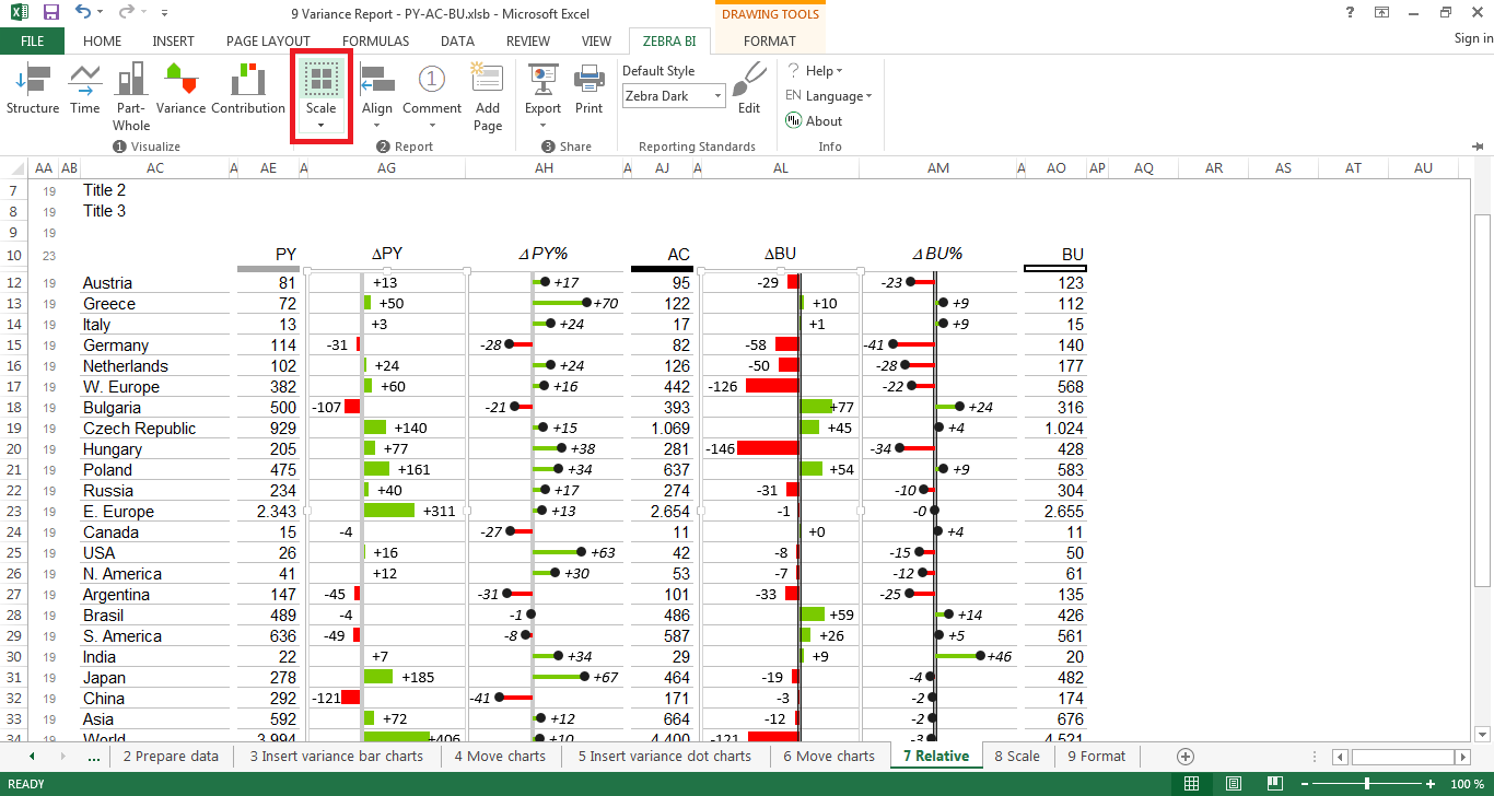
5. Scale your charts
One of the biggest mistakes leading to misinterpretations of data is not properly scaling charts. Both charts have to be applied to the same scale to be comparable.
Luckily, Zebra BI has a function for that. Just select two charts (of the same kind, i.e., either absolute or relative) at the same time (using the CTRL key on your keyboard) and click on Scale in your Zebra BI ribbon. Then repeat the step for the other chart type. Perfect! Your charts are now scaled and ready for interpretation.
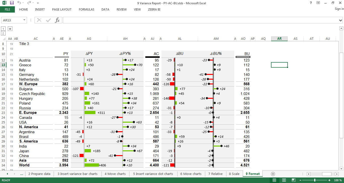
6. Apply formatting
Your report is now almost finished. All you need to do is make it a bit nicer to look at and emphasize important features of your report, as for example subtotals (in our case the different continents). For this, we suggest you apply formatting as recommended by IBCS. The subtotals should therefore be formatted bold. Inserting additional lines helps readers to understand immediately that the values in this particular row are sums of the previous rows.
If you want to export your presentation to PowerPoint afterwards, it is also recommended to get rid of the standard Excel gridlines (you can remove gridlines like this).
Furthermore, applying a light grey background color to the cells behind the charts also fosters readability.
Last but not least, insert your main message that you want to convey to your readers at the top of your report and add comments if necessary.
Tadaa, your report is now finished 🙂