
Variance Analysis
Variance Analysis is probably the most required and frequently used analysis in business reporting. That’s why Zebra BI offers extensive support for variance analysis by allowing you to easily create the following types of visualizations:
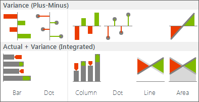
Variance Analysis charts in Zebra BI
Variance charts in Zebra BI are organized into two major groups:
Let’s first explain the “plus-minus” charts and how to use them.
Variance (Plus-minus) Charts
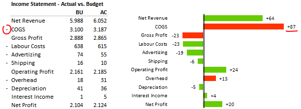
A plus-minus (also called “red-green”) chart automatically colors columns or rows green or red depending on the value of the variance (whether it is positive or negative). This is the most intuitive way to visualize deviations (e.g. from plan or budget, from previous year, etc.) or profit/loss.
You should prepare your data for variance analysis in one of the following two ways:
1) Single Column
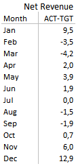
A Variance data table – 1 column
The deviation is already calculated in a single column, e.g. Actual-Budget (absolute deviation from the plan), % Actual-Budget (relative deviation from the plan), % growth from previous year, etc.
2) Two columns
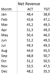
A Variance data table – 2 columns
Your source data contains two columns that you would like to compare, such as Actual vs. Budget, Actual vs. Forecast or Actual vs. Previous Year. Zebra BI will automatically calculate the variance (both absolute or relative).
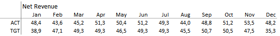
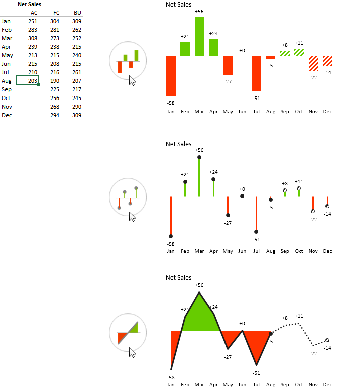
For time series data (variance over time) you can also prepare your data in a horizontal table:
Variance data in a horizontal table
To insert a variance chart, select the data (select the whole range or just click anywhere inside the data range), click on 1) Visualize > Variance > Variance (Plus-Minus) and select the appropriate shape (column, line, area, dot, etc.) and orientation:
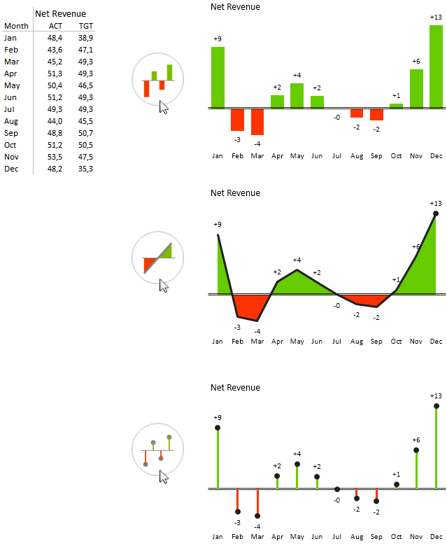
Inserting horizontal variance charts in Zebra BI (display variance over time)
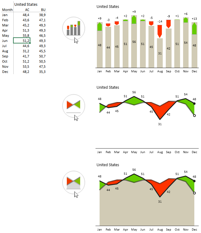
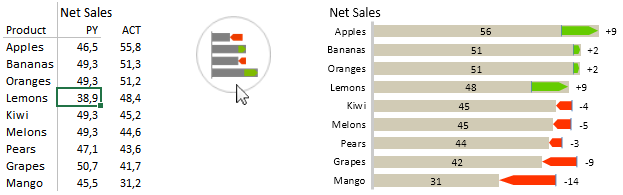
In a similar way, you can insert vertical variance charts to display variance by products, countries, profit centers or other “structure” dimensions:
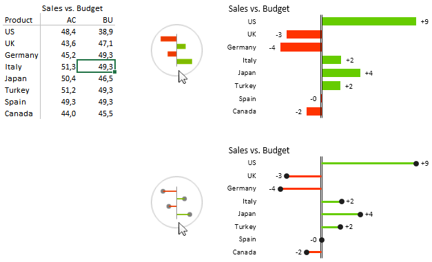
Inserting vertical variance charts
To display relative variance (in %), just click on the Chart settings icon (“gear”) and select Relative (%) under the Display Variance option:
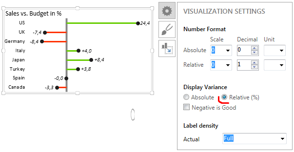
Displaying relative (%) variance in Zebra BI
Zebra BI will calculate the relative variance for you and display number labels in the selected Number Format for relative numbers. By default, Zebra BI automatically displays all relative numbers in italics and without the % sign, so that they are distinguished from absolute numbers and that labels are minimized. If you need to display a % sign, select “%” from the Unit drop down menu in the Number Format > Relative option.
For measures like costs where a negative variance has a positive meaning (it is good if actual costs are below budget), use the Negative is good option:
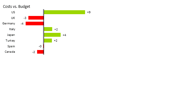
Variance chart – negative is good
Not only this, Zebra BI allows you to assign the negative meaning to any data category. You might find this useful when analyzing variances of different KPIs in the same chart, for example variances in a P&L statement (if costs are above budget, the variance is positive, but it should be red, because this is not good).
To achieve this, just write a minus sign (-) in a separate column in front of the corresponding category name in your data table:
Variance chart – assign negative meaning to any category
Great, now you are ready to create your first variance reports. Here are some ideas that you may find useful:


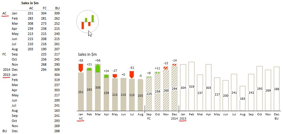
Variance Analysis – Using multiple chart segments
All horizontal (time series) Zebra BI charts support multiple chart segments. You can also analyze variances with more than just two data scenarios in one single visualization, for example Actual vs. Budget until the current month and Forecast vs. Budget for the remaining months of the year.
Zebra BI will detect which data is available (cells are not empty or do not contain null values – #NA) in columns and automatically apply the standard design of the selected notation (style). For example:
Actual + Variance (Integrated Variance) Charts
The Actual+Variance chart, often called “Integrated Deviations” or “Integrated Variance”, visualizes deviations along with actual values. This is one of the most useful visualizations in management reporting. Although you might experience difficulties with labeling data in some cases, this chart is an optimal visualization of both actual and deviation values simultaneously, because it allows the reader to assess the values with a minimal number of eye movements, called saccades. The minimization of eye movements is one of the key goals of Zebra BI, which we have most carefully pursued throughout the development.
The data for Actual+Deviation Analysis must contain at least two columns: A base column (e.g. actual sales values) and a comparison column (e.g. target values or previous year values).
To produce an Actual+Deviation Analysis,
- Select the data (whole range or just click on any cell inside the data range) and then
- Click on Visualize > Variance > Actual+Deviation and select the appropriate shape:

Inserting an Actual+Variance chart
You can also insert vertical Actual+Variance charts to display variance by products, countries, profit centers, etc:
Inserting a vertical Actual+Variance chart
If you use standard labels for data scenarios as defined in Reporting Standards (IBCS), such as for example ACT, TGT, PY, FC, etc., then Zebra BI will automatically detect the right data series for the base column and the comparison column. If you use other (arbitrary) labels, then Zebra BI will consider the first column as the base column and the second one as the comparison.
As with other time series charts, you can use the display more chart segments if you have data for several data scenarios (e.g. Actual, Forecast and Budget).
You can even display additional category labels below the axis. Just write them in a separate column in front of the category names in your source data (as depicted in the following example):
Variance chart with segments and additional category labels