
Inserting difference highlights
The goal of visualizing data with charts instead of plain tables is to bring clarity to the readers and decrease the time it takes them to get the key piece of information from the data.
This is usually achieved by removing all unnecessary items and emphasizing only the important ones. One of the best tools for this is a difference highlight.
With Zebra BI, all it takes to insert difference highlights is one click. Here is inserting a difference highlight to 6 charts at once:

The settings of difference highlights explained
There are a three settings for difference highlights that you can change. Here is the settings box that appears after you insert a difference highlight:
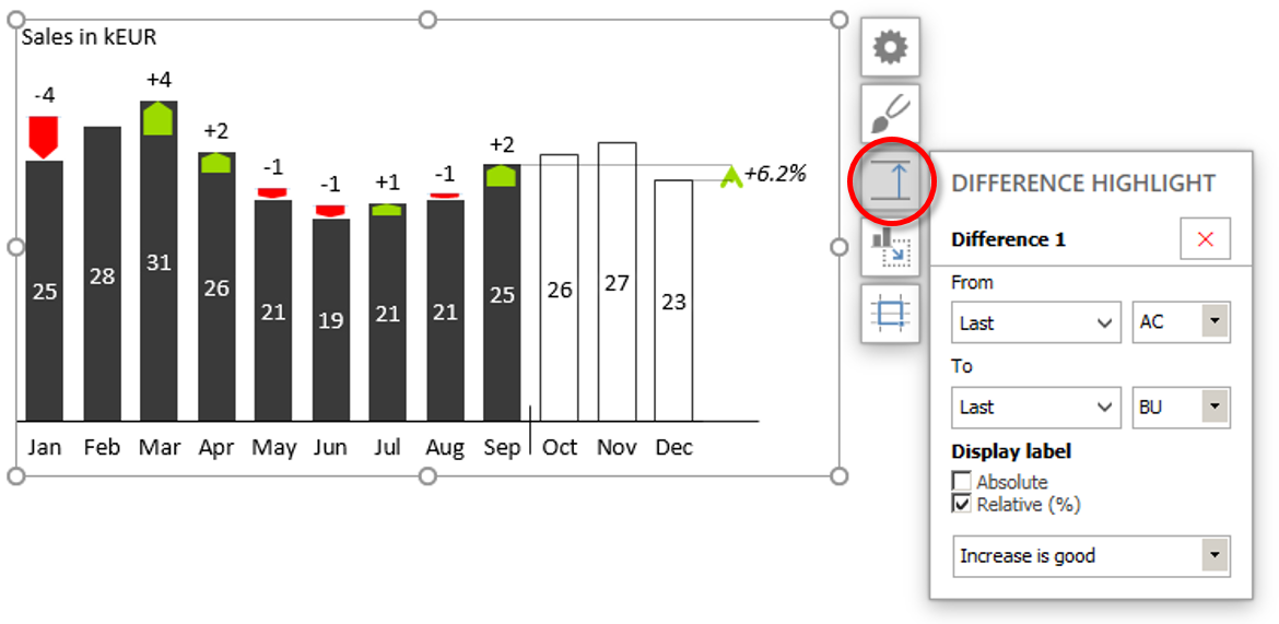
- The “From” and “To” dropdowns are used to set the start and end points of the difference highlight.
- You can choose from 5 dynamic start and end points (First, Last, Next to last, Min and Max) and all categories (axis labels) – static start and end points.
- With the dropdowns on the right you set the Category class (usually AC, BU, PY and FC) of the start and end points of the difference highlight.
- With two “Display label” checkboxes you control how the value of the difference is displayed (by default it is displayed in percentage).
- Your choice for the last setting depends on the nature of the KPI you’re displaying on the chart:
- Use “Increase is good” for KPIs with positive effect, e.g. Sales
- Use “Increase is bad” for KPIs with negative effect, e.g. Costs
- Use “Increase is neutral” for neutral KPIs, e.g. Headcount
How to delete a difference highlight
To delete a difference highlight just click on the red X in the top right corner of the settings box.
How to change the style of difference highlights
You can choose from three different arrow styles for difference highlights. To change the style click on Edit style on Zebra BI ribbon, go to the Shapes tab and select an arrow style from the Difference Highlight dropdown menu:
![]()
Now that you have changed the arrow shape in your style, you can apply your new style to existing chart by clicking on the chart and selecting Apply Style. Also, all the charts that your will insert subsequently, will automatically have the selected arrow style.