
Part-To-Whole Comparison
In business reporting, stacked charts are used for analysing the proportion of parts to the whole value. Zebra BI offers both horizontal (column) and vertical (bar) stacked charts with some advanced features that make these business charts really useful for part-to-whole comparisons:
Part-to-Whole menu in Zebra BI
Since stacked charts are often too cluttered and hard to understand, Zebra BI offers advanced features to make sure that they are designed in the most legible way possible. In contrast to other business charts, both vertical and horizontal stacked charts display values over two dimensions. For example:
- sales by (1) market and (2) product category,
- costs by (1) cost centres and (2) accounts,
- sales by (1) product and (2) time,
- etc.
When one of these two dimensions is a time dimension (time periods like months, quarters, years, etc.), then you should use a horizontal Part-Whole (stacked) chart. In all other cases use vertical Part-Whole charts.
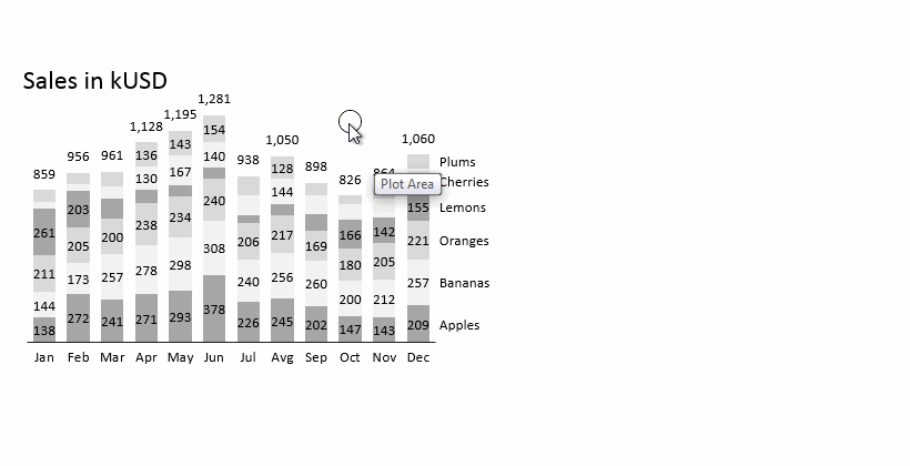
Horizontal Part-Whole (stacked) charts
When creating a horizontal Part-Whole chart, just remember this important rule:
To insert the chart, prepare your data in a uniform table, with time periods (e.g. months, quarters or years) in columns and categories (e.g. products, countries, accounts, profit centres, etc.) in rows. Then:
- Click anywhere inside your table and
- Select Part-Whole > Column chart in Zebra BI
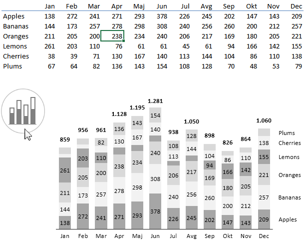
Inserting a horizontal Part-Whole business chart in Zebra BI
As you may have noticed, Zebra BI has:
- Calculated the total values (whole) and displayed them above the columns
- Applied a qualitative color scale in an alternate pattern to easily differentiate data series
- Displayed an adaptive legend so that series names are exactly aligned with numbers
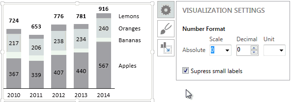
- Suppressed the display of small numbers so that the chart is legible
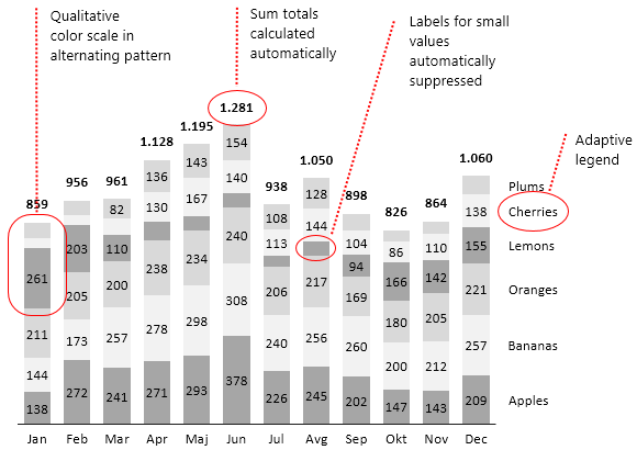
Features of a Part-Whole chart in Zebra BI
If you make the chart smaller, labels for small values will be automatically suppressed (hidden), so that the chart has optimal readability:
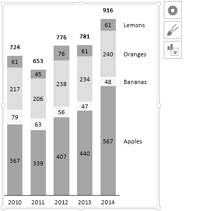
Small numbers are automatically suppressed
If you want to display all number labels even if they are very small, clear the Suppress small labels option in the Chart Settings:
Another feature we have introduced recently is the ability to move the legends from right to left in part-whole charts.
Part-Whole charts with data scenarios
As with other horizontal (“time”) charts in Zebra BI, the Part-Whole chart can also have multiple data scenarios. For example if you want to display actual data for this year and budget data or forecast for the next year, just write the appropriate scenario labels (e.g. PY, AC, FC, BU…) above the corresponding columns in your data table:
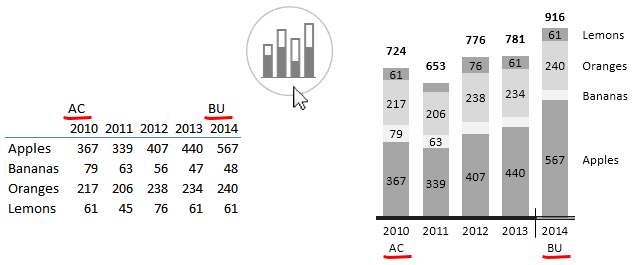
A Part-Whole chart with data scenarios
Zebra BI will display your scenario labels at the bottom of the chart and also design the axis to mark data scenarios (“semantic axis”) consistent with the current reporting Style that you are using. A small delimiter additionally marks the categories, where the data scenarios change.
Vertical Part-to-Whole comparisons
If both the rows and columns in your data table represent discrete categories (business dimensions other than time periods, e.g. products, markets, countries, sales channels, accounts, cost centers, etc.), then you should use vertical Part-Whole charts. Let’s take a look at the following example, where sales are displayed by countries and sales channels:
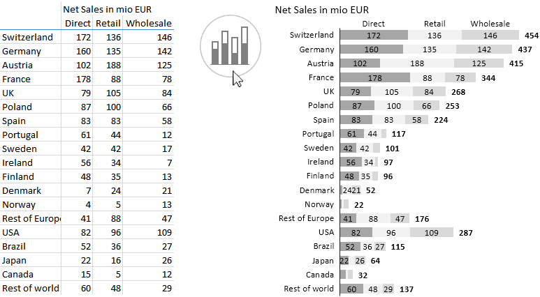
Inserting a vertical Whole-Part chart in Zebra BI
As you have probably noticed, the rows in the table are displayed as rows in the chart. Here’s a quick tip for you: In practice, try to put longer dimensions (the one that has more elements) in rows.
Perfect, you have mastered the Part-Whole comparisons!