Zebra charts explained in detail. Variance charts, Waterfalls, time series, dot plots, part-to-whole (stacked) charts, Hills&Valleys…

Which chart should I use?

In this article we will explain how to choose the right chart for your data. Or more precisely, for your message. There are 3 fundamental rules that you should always follow. If you learn these 3 rules, there is a good chance that you will get it right no matter what the context of your data is.


  • #1 Orientation

    Should I use a vertical or a horizontal chart?

  • #2 Task

    What analytic task will the readers perform?

  • #3 Shape

    Should I use lines, bars, dots or something else?

Read more

Structure Analysis

Structure analysis is the most basic analytic task: The reader observes the displayed values and visually compares data categories to each other. These comparisons are usually of the following nature:

  1. Looking up a specific value (e.g. finding the sales value of a specific product)
  2. Comparing two values
  3. Ranking (trying to establish the sequential order of one or more data categories)
  4. Observing patterns in the data (subsets of values with a specific pattern) 

With Zebra BI you can insert the following structure visualizations:

Structure Charts in Zebra BI

Structure charts in Zebra BI

Read more

Time Series Analysis

Time series analysis is performed when the data categories represent time (years, quarters, months, weeks, days). You should always visualize time series with horizontally oriented charts (naturally ordered left to right). Zebra BI offers the following visualizations of time series data:

Time Series Charts in Zebra BI

Time Series charts in Zebra BI


Read more

Part-To-Whole Comparison

In business reporting, stacked charts are used for analysing the proportion of parts to the whole value. Zebra BI offers both horizontal (column) and vertical (bar) stacked charts with some advanced features that make these business charts really useful for part-to-whole comparisons:

Part-to-Whole Comparison menu in Zebra BI

Part-to-Whole menu in Zebra BI


Read more

Variance Analysis

Variance Analysis is probably the most required and frequently used analysis in business reporting. That’s why Zebra BI offers extensive support for variance analysis by allowing you to easily create the following types of visualizations:

Variance Analysis charts in Zebra BI

Variance Analysis charts in Zebra BI


Read more

Contribution Analysis – Waterfall Charts

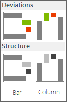
Contribution Analysis is a special type of part-to-whole analysis where we use the so-called “Waterfall Chart” to assess the contribution of specific data elements to the whole value. With Zebra BI you can insert contribution analysis from time series data (use column / horizontal charts) or from discrete categories (use row / vertical charts to show structure) with just 1 single click:

Contribution Analysis menu

Contribution Analysis menu


Read more

How to add highlights to your charts

Highlights are important if want to draw the attention of the reader of your report on one specific element of the visualization. For example if it is imperative to delivering your main message. With Zebra BI you can therefore easily emphasize important sections in your business chart or report – it just takes one click!

Read more