Using page templates – Profit-Loss report
Here we’ll explain step-by-step how to create contribution charts and align them with tables. Use this page template to create clean and informative profit-loss reports. Here’s how to start:
1. Insert a new page template
To start off, we’ll show you how to insert a page template. Afterwards you’ll learn how to use them properly.
Inserting a new page template is easy, just click the Add Page button on your Zebra BI ribbon. A new window will open, allowing you to select your desired page template. There are 9 different page templates to choose from, each serving a distinct purpose. In this post, we will explore the template for a standard profit-loss analysis.
Hint: You can also design your own report page templates and move them into the page template folder to be easily available to all employees in your company.

2. Add your data
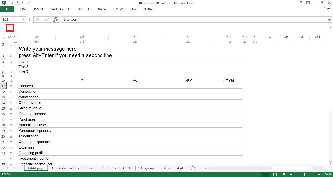
2.1 Click on the “+” button
Now that you have inserted your first page template, you can start adding your data. For simplicity purposes we’ve added a little extra space for your source data in case you want to calculate something which you don’t want to show up in your final report/slide. To open the place where you should put your data, click on the little “+” sign on the top left (indicated by the red square in the screenshot below).
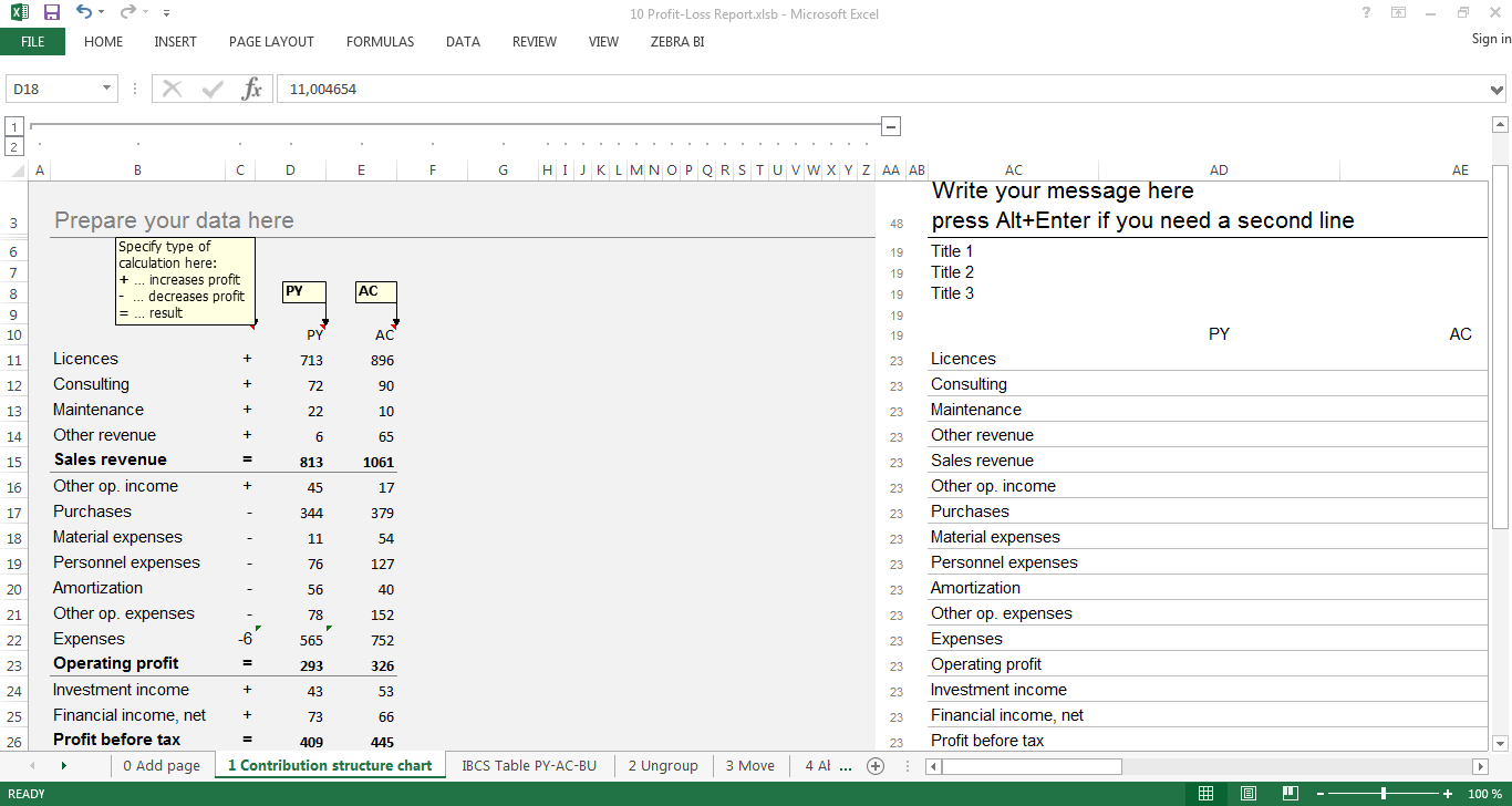
2.2 Prepare your data
You can use the additional field next to your added page to store and prepare your data. This is especially useful if you need to calculate certain KPIs in columns which you don’t want to show up in your report. Also it can come in very handy if you don’t want links between your worksheets and/or want to use pivot tables. In our example, you just create a standard profit-loss table with revenues and expenses. Indicate the impact of the positions in your statement by adding “+” for revenue, “-” for expenses or “=” for (sub-)totals in front of the respective positions. Zebra BI will understand these signs and automatically apply them to your waterfall structure chart. You can hide the Prepare your data here section just as easy as you made it appear – Just click the minus button and it’s gone.
3. Insert your charts
3.1 Create the contribution structure charts
In order to create the contribution structure chart, just select the range of cells constituting the data for your chart, and then click on the Contribution button in the Zebra BI ribbon. You have several vertical and horizontal charts to choose from. For this kind of data, we recommend using structure bar charts.
Zebra BI will create two scaled charts (one for PY and one for AC) which are grouped together. As you can see, Zebra BI recognized the operators for each row and automatically graphed the contributions appropriately.

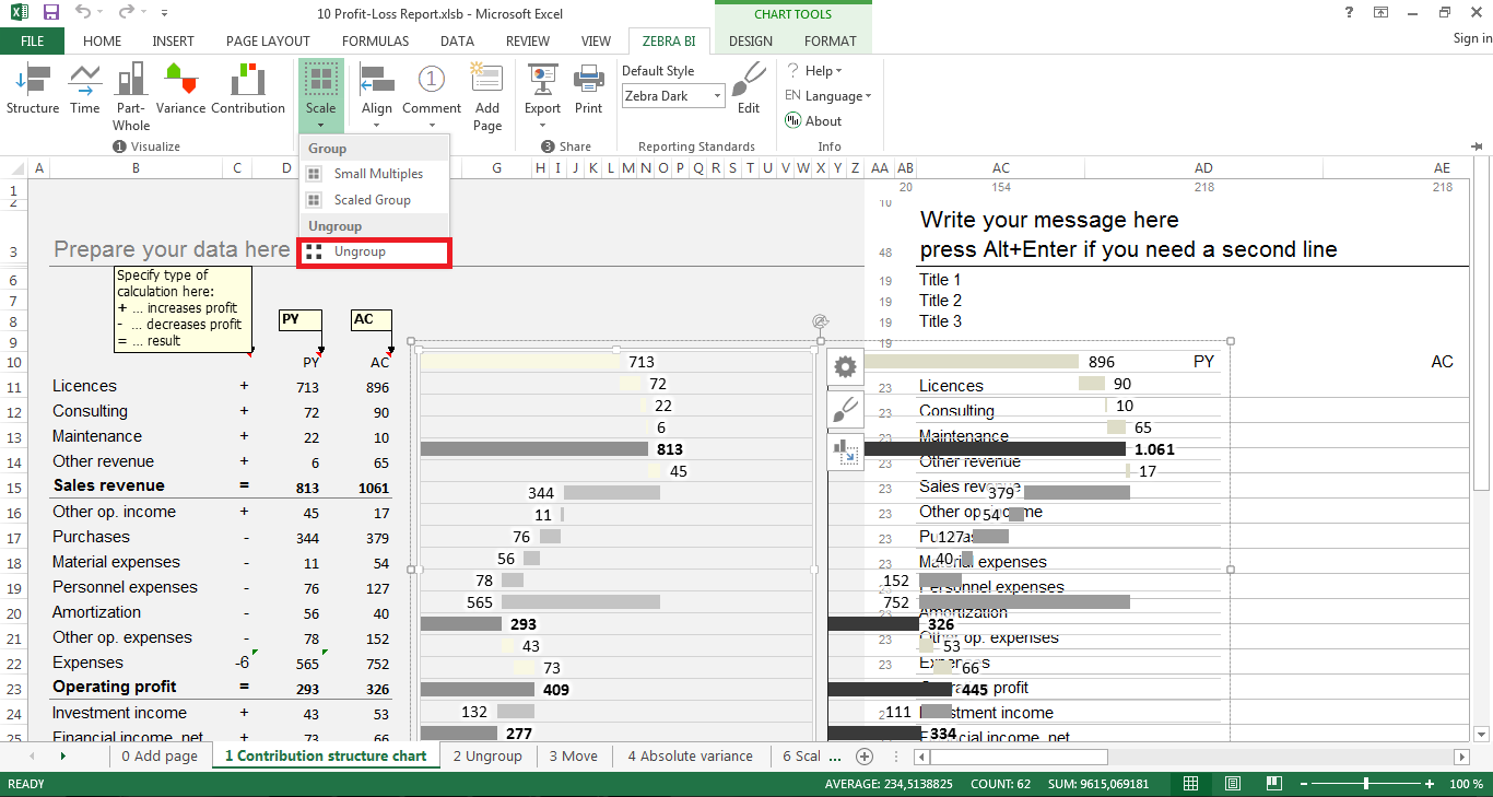
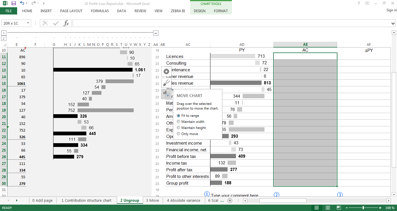
3.2 Ungroup charts
To be able to compare the two charts, Zebra BI immediately scaled them. A side product of this is that both charts are inserted as one “image”. So for you to be able to separately insert your charts into two different columns, we first need to “ungroup” them. To do so, just select your chart, click on the arrow below Scale in your Zebra BI ribbon and choose Ungroup. You should now have two separate charts which you can fit to the desired cell ranges.
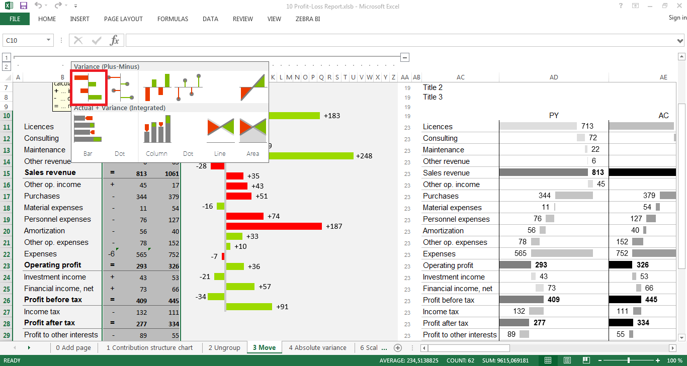
3.3 Move your charts
In order to properly include your charts into the reporting template, you will have to fit them to a cell range. This is done by selecting the respective chart, clicking the Move chart button and choosing Fit to range. Now all you have to do is mark the desired cell range and your chart will be moved into the respective column (in our example, the columns labeled PY and AC).
3.4 Create absolute variance chart
Well now that we have the two individual contribution charts for PY and AC, we probably want to know how much we deviated from the previous year, or more precisely, we need a chart for the absolute variance. Creating this chart is just as straight-forward as creating any other chart. Select the data range, click on Variance in the Zebra BI ribbon and select the first chart. Then move the chart to the desired cell range – just like we’ve explained in the previous step.
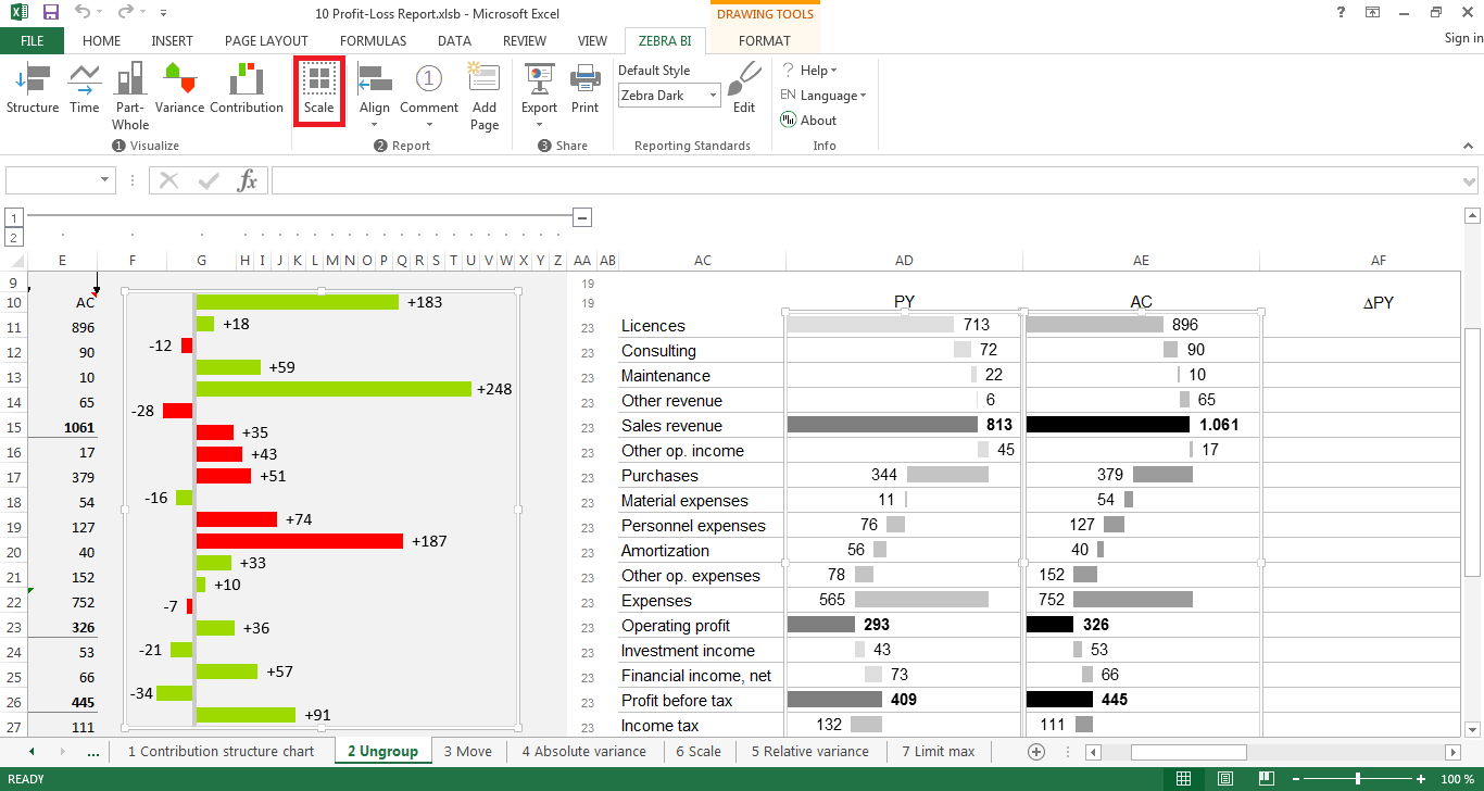
3.5 Scale the chart
Again, to be able to compare the charts, they have to be scaled. Therefore you should select the newly created variance chart and both of the other charts and click Scale in your Zebra BI ribbon. The absolute variance chart is now scaled and can be graphically interpreted in relation to the other two graphs.
Hint: In order to keep the right scale for all your charts, you should only scale the charts after you fitted them to your desired cell range. Fitting a chart to a cell range after you scaled it may temper with the scaling. Now that you have scaled the chart, it will again be grouped together with the other two charts. To ungroup them just follow step 3.2 as explained above (i.e, select the charts, click Scale and then select Ungroup).
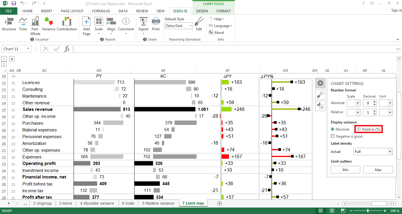
3.6 Create the relative variance chart
Creating a relative variance chart works exactly as inserting an absolute variance chart – plus one additional step. We recommend using pin charts for displaying relative variances. So instead of clicking the first variance chart, you should choose the second one. All other steps are exactly the same as before. Therefore, you first follow all the steps described under point 3.4. Then all you have to do is click on the pin chart, select the settings button (the one looking like a gear) and choose Relative (%). Zebra BI has now calculated the relative variances for you and changed the chart accordingly.
Hint: Afterwards, you can move the chart into a desired range of cells by following step 3.3 (in this case, into the column labeled ΔPY%).
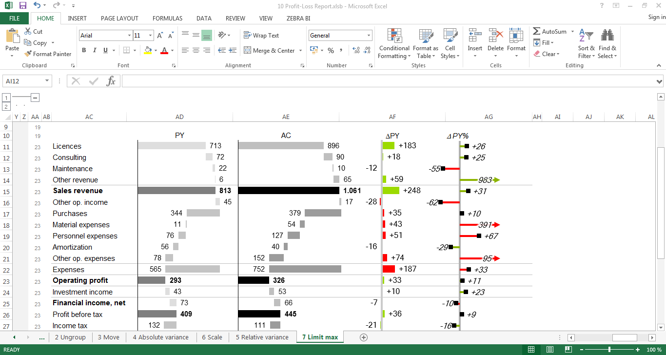
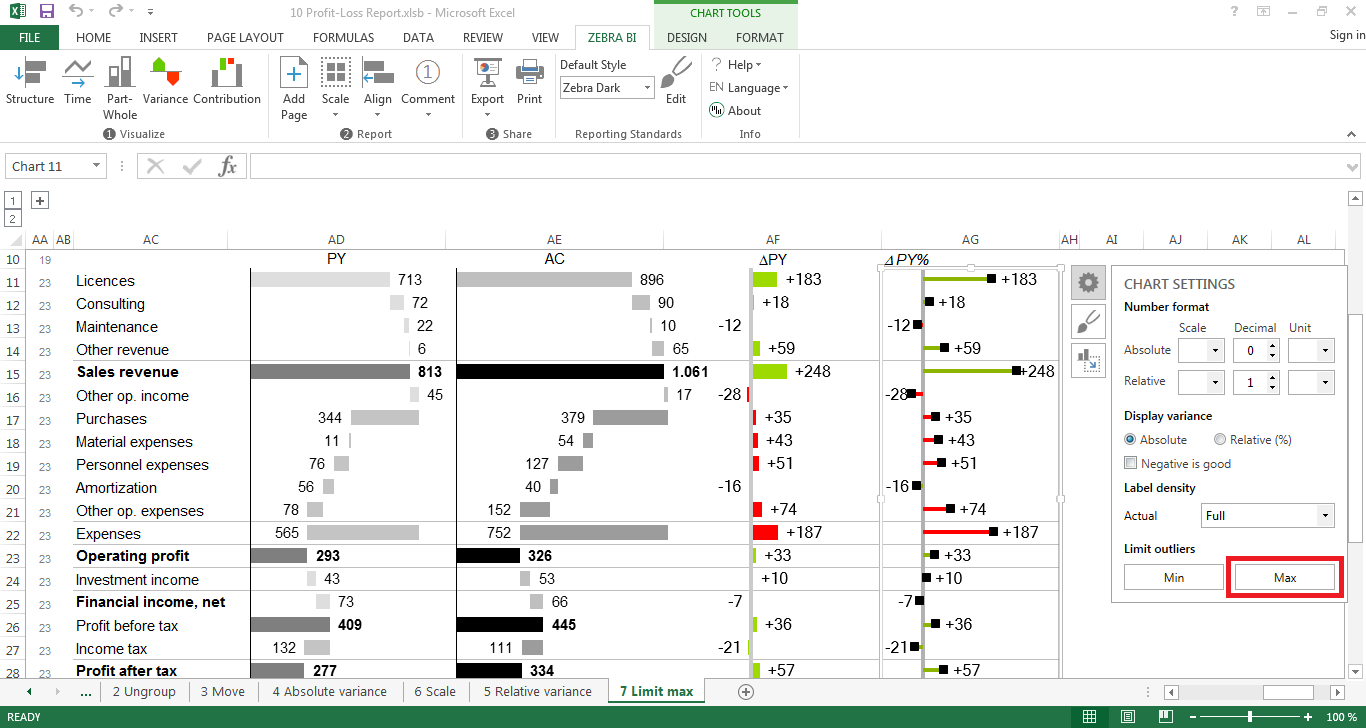
3.7 Limit max
As you can see, the last chart we created (the relative variance chart) does not look very informative. This is due to so-called outliers which are values that are excessively large (in this case, position no. 4 “other revenues” +983%). These values impede the graphical representation of all other values as they “scale down” the relative expression of the smaller values. To account for these kinds of situations we included an option to disregard the graphical representation of such values. This option is called Limit max. Just select the respective chart, click on settings and choose Limit max. Zebra BI will automatically recognize the outliers larger than the chosen limit and change its representation to an “arrow”-pin. This arrow-pin indicates that the value is indeed much bigger than its representation but has been excluded for readability purposes.
4. Apply formatting
Your report is now almost finished. All you need to do is make it a bit nicer to look at and emphasize important features of your report, as for example subtotals. For this, we suggest you apply formatting as suggested by IBCS. The subtotals should therefore be formatted bold. Inserting additional lines helps readers to understand immediately that the values in this particular row are sums of the previous rows. If you want to export your presentation to PowerPoint afterwards, it is also recommended to get rid of the standard Excel gridlines (you can remove gridlines like this). Furthermore, applying a light grey background color to the cells behind the charts also fosters readability. Last but not least, insert your main message that you want to convey to your readers at the top of your report and add comments if necessary. Tadaa, your report is now finished 🙂