
Contribution Analysis – Waterfall Charts
Contribution Analysis is a special type of part-to-whole analysis where we use the so-called “Waterfall Chart” to assess the contribution of specific data elements to the whole value. With Zebra BI you can insert contribution analysis from time series data (use column / horizontal charts) or from discrete categories (use row / vertical charts to show structure) with just 1 single click:
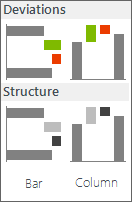
Contribution Analysis menu
Contribution Analysis is the optimal data visualization in cases where the whole (total) values (visualized as “fixed” columns or rows) are explained by partial (subcategory) values (usually visualized as red/green columns or rows). To illustrate this, let’s take a look at three typical examples of analytic tasks where you should use contribution analysis:
Profitability Analysis
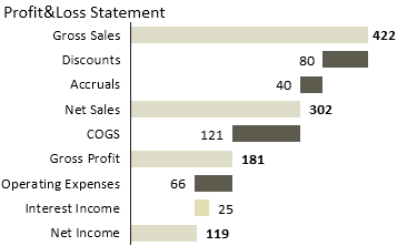
Profit&Loss statement
Analyzing contribution margins of profit centers, products, customers, etc. or Profit&Loss Reporting, (P&L) Statement and Income Statement
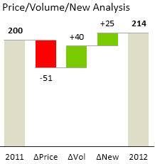
Price/Volume/New Analysis
Price/Volume/New analysis
Analyzing the impact of price change, volume change and new launches on sales performance.
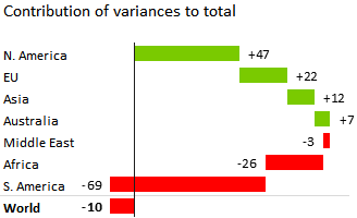
Contribution of Variances
Contribution of variances to total
Analysis of cumulative deviations across several periods of time (for assessing year-to-date/YTD or rolling period values)
Two major types of Contribution analysis (Waterfall charts)
Zebra BI offers two types of waterfall charts:
1. Contribution of variances
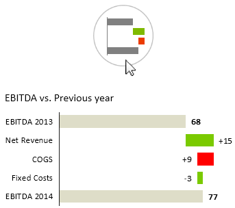
Contribution of variances
Use this chart when the contribution elements represent variance, for example variance from budget or growth from previous year.
For example, the Net Revenue here represents the absolute growth of the Net Revenue from the previous year.
Variances always displayed with +/- sign in front of the value and they are always red/green.
2. Contribution of structure elements
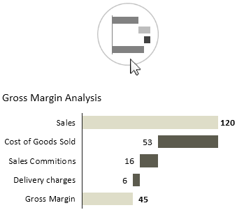
Contribution of structure elements
Use this chart when all elements are actual values of a structure, such as elements of income statement.
E.g. in the above case the Costs of Goods Sold (COGS) represents the actual value of COGS in observed period and we can asses how it contributes to the erosion of Gross Margin from Sales.
The color is NOT red/green, because red/green is reserved for variances only! Instead, the colors for Good / Bad are used.
Preparing data and inserting waterfall charts
In order to create waterfall charts for contribution analysis, you must add an additional column to your source data table. The column marks »fixed« data categories and optionally also the values with negative meaning, such as discounts, costs, etc. This column is called the Category Class column. Let’s illustrate this with an example:
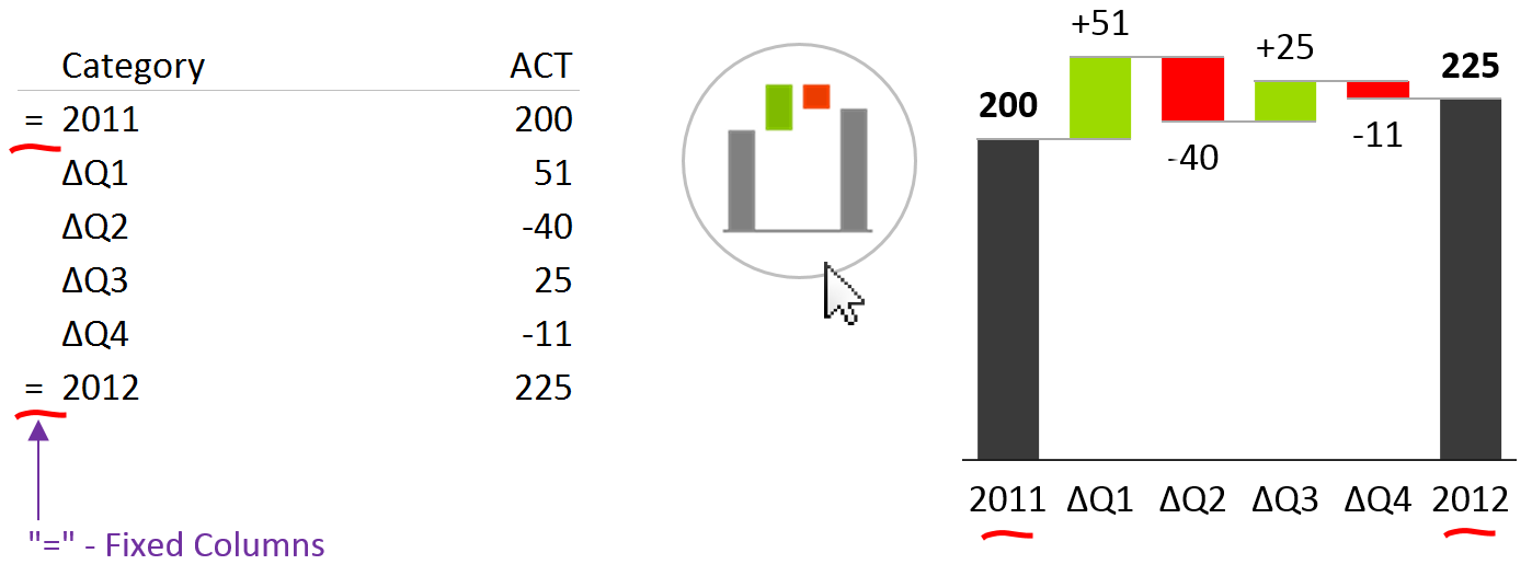
Inserting a waterfall chart in Zebra BI
This contribution analysis explains how each quarter contributed to the growth of sales between the years 2011 and 2012. The first and last column (grey) represent the sales value in the corresponding year (2011 and 2012), while quarterly values are absolute deviations from the year 2011 (absolute sales growth, represented by red/green columns). In this way, the user can evaluate the contribution (positive or negative) of the sales performance of each quarter to the annual sales.
The category class column must contain the symbol “=” in the rows where you want the values to be fixed (whole values, such as Previous Year or Actual in the example above), while it should stay empty in all other rows (partial values / contributions, such as quarterly deviations in the example above).
Profitability Analysis or P&L Statement
Now let us create a simple profitability analysis with a vertical waterfall chart:
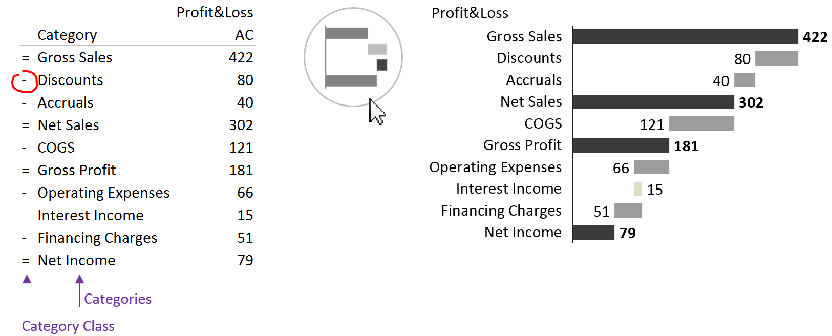
Creating profitability analysis in Zebra BI
As you may have noticed, some data elements are marked with a minus (-) sign in the Category Class column. These are accounts that have a positive value, but this value has a negative meaning, such as costs, discounts, etc. In a typical P&L statement you will have data elements (accounts) of different types. It is very important to understand those types of values to produce the correct report.
Sub-calculations
You can also create waterfall charts with sub-calculations:
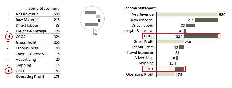
Vertical waterfall charts with sub-calculations in Zebra BI
In the example above, you’ll notice two numbers “-4” and “-5” in the Category Class column. This means that the bar for COGS will be displayed relative to the bar of the 4th element above COGS – Net Revenue. Because of the “-” the bar has a negative meaning and will go to the left. Similarly the bar for OpEx will be displayed relative to the bar of the 5th element above it – Gross Profit. This allows you to display sub-calculations in your waterfall charts (in our example the value for COGS is the sum of values of Raw Material, Direct labour and Freight & Cartage). Note: you can also specify positive numbers in the Category Class column. This will make the bar go to the right (positive meaning), relative to the specified row above it.
Here is the complete set of category classes and how they should be marked in the Category Class column:
| CATEGORY CLASS | DESCRIPTION | EXAMPLES |
| = | Fixed (whole) value | Sales, Gross Profit, Profit/Loss, … |
| – | Contributions where numbers have negative (inverted) meaning – positive number is bad and negative number is good | Cost, Discounts, … |
| [empty cell] | Contributions where numbers have positive meaning | Subventions, Financial Income, … |
| [number] (positive or negative) | Sub-calculations. The bar is displayed relative to the specified bar above it | COGS, OpEx |