Organizing Small Multiples
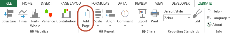
When selecting a Small Multiples report (by clicking on its edge or clicking once on any chart inside the report), an icon will appear at the top-left corner:

How to highlight important data, write messages, insert comments. And, very important: how to scale charts properly.
When selecting a Small Multiples report (by clicking on its edge or clicking once on any chart inside the report), an icon will appear at the top-left corner:
Edward Tufte, one of the leading authors on information design, discussed the value of high-information graphics in his work “The Visual Display of Quantitative Information” (1983). He identified a method of repeating small-sized charts in a two-dimensional matrix or grid and named this method “Small multiples”. In his later work Envisioning Information (1990) he claims:
For a wide range of problems in data presentation, small multiples are the best design solution.
– E. Tufte, Envisioning Information (1990)
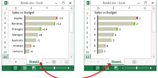
Making copies of sheets with Zebra BI charts in them has been supported for some time. Now, since version 1.6.0 Zebra BI supports copying and moving sheets to another file. This was one of your most frequent requests and we listened!
The goal of visualizing data with charts instead of plain tables is to bring clarity to the readers and decrease the time it takes them to get the key piece of information from the data.
This is usually achieved by removing all unnecessary items and emphasizing only the important ones. One of the best tools for this is a difference highlight.
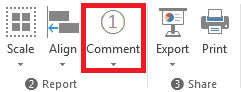
Zebra BI allows you to insert various different symbols into your reports. To insert a comment just click the comment sign on your Zebra BI ribbon. It looks like this:
Continue reading to find out what comments are available and how to use them appropriately.
Here we’ll explain step-by-step how to create contribution charts and align them with tables. Use this page template to create clean and informative profit-loss reports. Here’s how to start:
Here we’ll explain step-by-step how to create variance charts and align them with tables. Use this page template to create clean and informative variance analyses for your report. Here’s how to start:
In order to make business reporting even easier, we’ve included a feature in Zebra BI v. 1.4 which allows you to produce standardized reports using page templates. To do so, we’ve added a button to the Zebra BI ribbon that lets you insert a page template in a new worksheet. This means that if you use our templates, all your reports (be it P&L, ROI, waterfall contribution charts, etc.) will always look exactly the same! You can even create your own personalized templates and include them in Zebra BI so they’re available to all users.
For your convenience we’ve sized these reports to be easily transferable into PowerPoint slides. The created slides fit perfectly into your presentations. Also, they are perfectly scaled for a standard DIN-A4 print-out.